Peak Body Rebrand


Peak Body Nutrition has recently undergone a brand new rebrand for their product range. The new designs created by Dimasoft compliment the business well and give it a fantastic new look.
Peak Body approached Dimasoft to ask for something that would modernise the brand and bring it in line with other competitors in the industry. This not only keeps them up to date in the online world but also ensures that they can continue to grow as a brand.
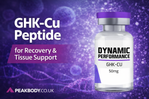
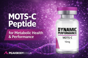
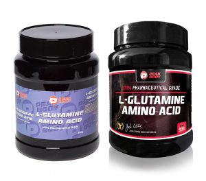
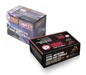
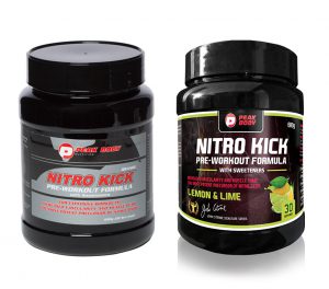
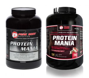
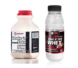
The old packaging designs consisted of very plain backgrounds consisting mainly of black and silver colouring. They now boast black and red packaging which suits their brand name better alongside subtle imagery designed to put a greater emphasis on flavour.
Peak Body before and afters:
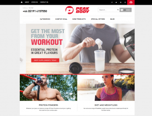
Likewise, the website design was outdated and featured colours that didn’t coincide with the packaging on their products. It has now been updated so that the new branding can be recognised across the board including on social media pages.
Old site:
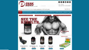
New site:
The new designs also have the John Citrone stamp of approval on every product, one of Britain’s most successful bodybuilders. John is the co-founder of the company along with his wife Kim Citrone and has over 50 years of experience in the bodybuilding industry.
Update - John Citrone now has a brand new look for his website.